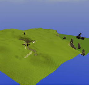
In designing more exterior areas, it's reminded me of something I noticed a while back when playing in the toolset - namely the different way that the exteriors in the OC were designed compared to how we're seeing them in community modules - namely, how they are textured.
The OC area tend to have a lot of textures painted down at 100%, and it's the use of complimentary textures that help them to blend. From what I've seen in other modules, and for me when designing an area, The only texture used at 100% tends to be base texture you start the area with - everything else is blended in. I thought I'd have a quick play:
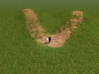
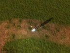
The top image shows two overgrown paths I quickly threw together. The left path (below) uses blended textures - the path is first painted down at 30%, then a smaller path within that at 50-70%, and patches are strengthened at 80-90%. Overgrown areas are first painted in a wider brush at 20-30%, and then gradually strengthened with smaller and smaller brushes with increasing pressure. The aim here for me is to try and blend things together - the muddy path slowly gives way to the surrounding grass. It's not the best choice of textures and there's no colouring, but it should get the point across. Personally when want a grassy plain, I never use one texture - I use 3-4 grasses blended at different percentages. Somehow two grasses painted over each other give a much smoother appearance - and you notice the repeating patterns in the underlying textures less.
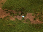
Below is the same path painted as how I understand the artists from the OC do it. What surprised me was that it wasn't as bad as I thought. The path is painted straight down at 100%, and patches of grass overgrowing it are also at 100%. Much quicker. And to be honest the effect is OK
SO as a little test to myself, I'm not sure what it proved. One issue that I find tricky is knowing where to start when painting textures, and combining that with shaping the landscape. But I'm now wondering if my slow blending approach might not actually be better as a quick 100% approach, with touching up left til the last. There's definitely an art to this - and when an area is going great, it's a lot of fun. I'm building an area very different to one I've built before at the moment, and it's almost as though a new set of rules needs to be applied for a different environment - e.g. grassy vs mountainous - compare the wilderness and Mountain areas in DA Chapter 1. But now I'm building Raven's lake, an abandoned gnomish village, which has many new things to think about in terms of darker textures and how they look in different lighting. Screenshots to come later.
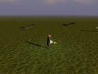
On a slightly different note - my other project this week has involved tentacles. Or me trying to model them in game. I takes me back to playing things like Shining Force - when you boat would be attacked by a giant octopus / kraken and you had to fight off each tentacle and the head. Would love to do a Shining Force conversion.. Anyway, below is a poor attempt - only problem is getting them to face the right way...and I lack any sort of modelling skills (computer graphics or catwalk). back to the drawing board...
By Any Other Name (Part II)
1 hour ago
