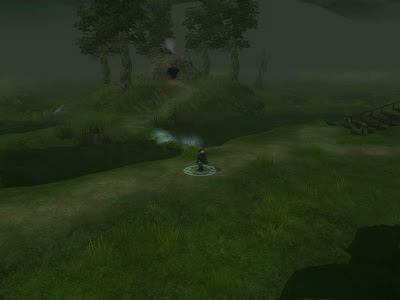
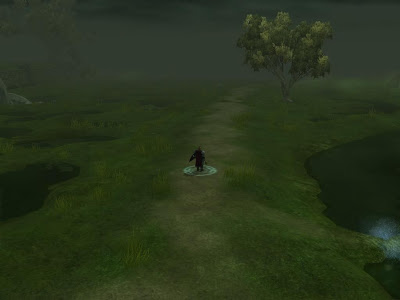
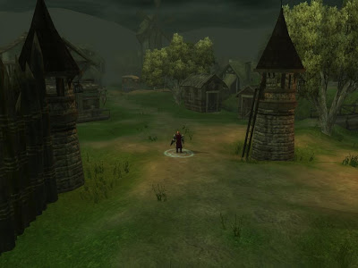
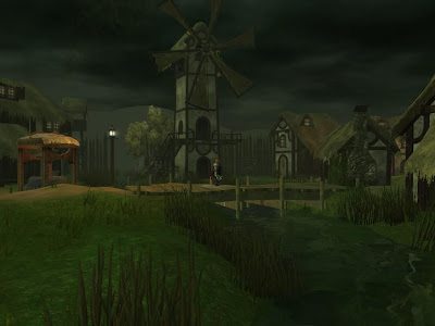
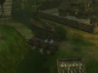
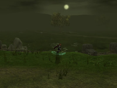
The more astute among you will notice the area hasn't change dmuch from the post a few below. Mainly i've been toying with the lighting settings and finishing up texturing on the swamp. Lighting has such a dramatic change on an area (and can cover a multitude of texturing sins). In many ways, I think there should be a DayNightStage section on the vault for people to share their work and findings - areas are given a new lease of life by merely straying from the standard settings - but finding the right settings for lighting one stage of the cycle e.g. daylight is hard enough, let alone sunrise, moonrise etc... I enjoyed playing with them in DA2 for the abandoned gnomish village and the interior smuggler's cave to get the darker, bleaker feel - two areas that look and fell very different under normal lighting! I'd bet this goes for the Misery Stone guys too.
Anyway, the village is bordering a desolate swamp and beset by troubles, so I decided against the sunny disposition of the earlier shots and went for more doom and gloom. Which is a bit of depressing theme I seem to be in.... would be nice to write characters that aren;t quite so broken... But then I have always felt you have to be broken to be an adventurer - stomping into sentient creatures homes and slaughtering them...
So speaking of broken characters, the final companion Ruevena is now finalised - after working through many iterations using Elysius' Battle of the Builds, which handily lets you restart the levelling process if somethign goes awry, and gives you the epithet feats for all PrCs. Ruevena will be Ranger 1 / Sorceror 6 / Eldritch Knight 1 / Shadow Thief of Amn 1 - which trust me fits with her backstory quite well. I also like to give enough leeway in the companion's classes that the player can then adapt them to fit into their party in several ways by selecting their level up package. What I'd love to do is give her a themed spelcasting list as a sorceror, which is a fun way of adding personality to them, and explaining what fuels a sorceror's power, but i'll have to stick with defining her selection for now.
Vowing not to touch the toolset until I've done a bit more planning now - I have 4 areas i've been building, and not filled them with any activity yet, so need to get back to that
NOTE: Any players out in Australia... check out the latest copy of Hyper (issue 179) - I was contacted by a journalist who's written a piece on NWN2 modules for that issue, and asked for some DA screenies. Good to see the community being highlighted!

9 comments:
It's true - lighting matters SO much, there could be a separate tutorial Just on that subject, which wouldn't even touch on the actual "psychology" of colors!
I have to say, those screens definitely portray a dismal feeling - great work there, buddy!
I totally agree on that we need some kind of DayNightCycle library, preferable on the Vault. I think I'll throw away a mail to Maximus tomorrow asking for a Lights and environmental settings category where we could share our settings.
Moody shots, thumbs up! Ruevena seems like my kind of girl so I'm looking forward to have her in my party.
Hi Wyrin,
I have spent some time over the last few days trying to add fellow bloggers to my own blog and catch up with how people are getting along with their NWN2 projects. :)
I hope to read over more of your blog in the coming weeks. I already listened to your podcast wih interest, and I hope to get the chance to check out your 'Dark Avenger' modules in the near future.
The latest screenshots look really impressive, and it does make me realise just how good people like yourself are at getting the environments to look so good.
Every time I see ones like that, I find I need to re-examine my own to consider how to improve them. I am no artist and am colour blind, which does not help. ;)
Anyway, I hope to drop by regularly and keep looking over your work ... and hopefully adding the odd comment. :)
Lance.
I'll echo what other people have said and say that those screenshots do look nice indeed. You've definitely breathed life into the area with a gelid gloom, and I definitely get an ominous, swampy atmosphere from what you're showing.
Very creepy light you have there in that swamp ! I´m definitly looking forward to walk around there.
And I agree with Amraphael, we do need a libary for different lightsettings. Maybe we can collaborate here and share our settings ?
Your area design has really improved. I've enjoyed all of your modules, but I have played Palace of the Silver Princess and Dark Avenger 1. There seems to be a steady improvement in each mod, the stuff you are putting out now is quite impressive.
Wyrin - I just checked out the latest edition of Hyper magazine today, and saw the very nice article on NWN2 - which covered a small grabbag of NWN2 modules.
Dark Avenger got a very nice write up, and the screenshots looked superb! Excellent work! Overall the article was very positive about the modules and NWN2 in general - If I didn't already own the game already I'd would have gone and bought it straight away in response! :)
Hey thanks AmstradHero - I'm hoping to get a copy by post but could take a while. Yeah, the journalist said he was aiming to highlight us modders so great to get some coverage!
Ahh. looks like a good place to settle down and find things to slaughter! mwahahah!
Looks great Wyrin! I'm very excited to travel to the next chapter! :)
Liso
Post a Comment