Wednesday, January 27, 2010
b0U/\cYrOc/<: m|sErY sTo/\e
So for playtime, I've been venturing into the mists of Misery Stone. Been reassuring for the NWN2 community to see the reception and appetite for this. I've got about as much playtime as I had during testing of this under my belt, and am having fun - the difficulty is toned down significantly from what I recall of my testing, tho. But scenery, atmosphere, custom content and execution are top notch. A few niggles for me in terms of combat variance and companion interaction (and psst! the dryad's animal companion is still nameless ;) ) but nothing to detract from it being a great fun game with bags of character.
But as I stood in the whispering woods area early on in the game I got to thinking. The area is great - looks stunning visually and had buckets of atmosphere. And you know I kinda prefer the areas I've seen here (and from other work e.g. by Anduraga, Azenn, Maerduin and Chaos Wielder, and Amraphael's exteriors for Zork) to anything I've seen so far in Dragon Age. But, DA does have better looking character faces - but hang on, Misery Stone has custom faces for the companions that look amazing... So you know what? Misery Stone, just ended up making me want to play DA but in the NWN2 engine. Three years on, it's shown that the engine has a lot to offer still and look current.
Kudos to the team and all involved, especially Jclef.
edited to include authors I shouldn't have forgotten - thanks Starwars!
Sunday, January 24, 2010
Loadscr... nah, only kidding! Manticores!


These images might have more to do with a misinterpretation of the first encounter which is actually listed as a gynopshinx. But the tail spikes are clear to see. So it was my hope to use the manticore model here and in the later encounter to replace the Spectator Beholder placeholder I had currently -the cover images are to iconic in relation to this module not to use it. The creature in the first encounter is described as mangy and bedraggled and sitting atop a pile of bones. So here we are:
The later encounter occurs in the Terraces of Doom (a level I'm fond of and may release as a prefab)
the terraces from above - run the gauntlet from the entrance to the exit in this inverted ziggurat!
In return for the favour, I offered to work up the creature blueprint and AI. Coding the AI was fun and I emulated Dirtywick's approach to implement the tail spike attacks without using 2da modifications (essentially spell creation) so the model is more widely usable. The script got a little cumbersome to take certain things into account such as deflect/protection from arrows, but now seems to be working fine - while it has tail spikes left, the manticore will unleash them and try to keep at range. If caught in melee, when it gets badly injured and has spikes left, it will try to flee to fire them again. Here some screenies showing the test module I used for trialing this out.
(Without resorting to bundling up more custom content and custom vfx I can't have the spikes fire from a tail node, sadly, but I think this effect works well and is less noticable in game. For scripters, I'm using the SpawnProjectile function and manually coding hit/damage in the custom AI)
This aside, I've also just made 7 stores for a hidden market to be found in the game at later levels. Store building is mind-numbingly time consuming if you want them to have flavour or a theme, so a trip tothe gym might be in order to wake me up.
Wednesday, January 20, 2010
Loadscreens 3
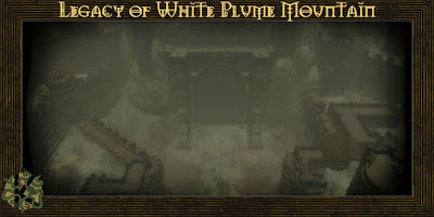
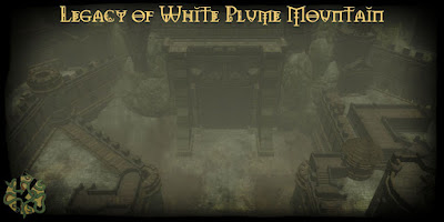
(FYI the font is that used in the 3rd ed Forgotten Realms logo)
Right, this weekend I stop messing about in photoshop and focus on the content!
Monday, January 18, 2010
Loadscreen take 2
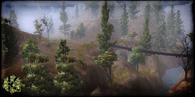
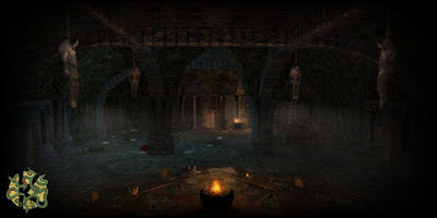
I feel I should also throw in the disclaimer, that there's several prefabs in use, albeit most modified to vary degrees - so I haven't suddenly become some mad area-baking fool...!
Friday, January 15, 2010
Loadscreens
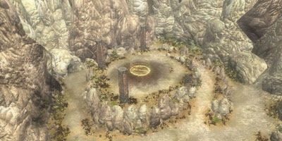
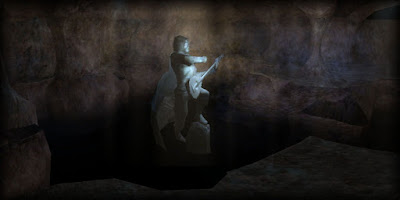
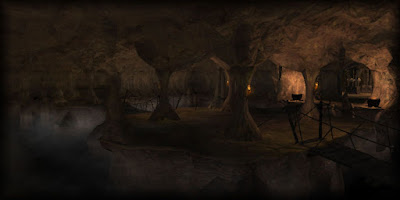

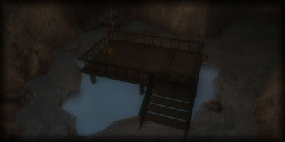
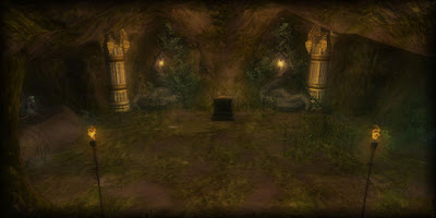
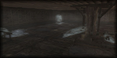
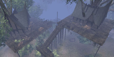
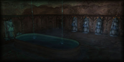
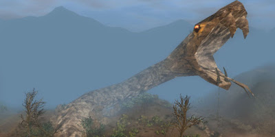
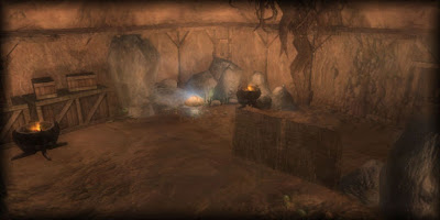
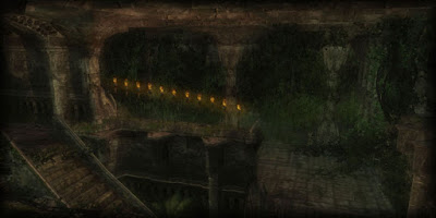
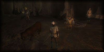
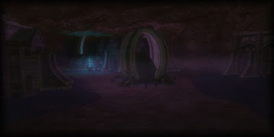
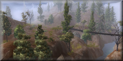
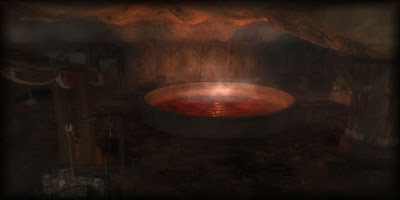
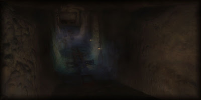
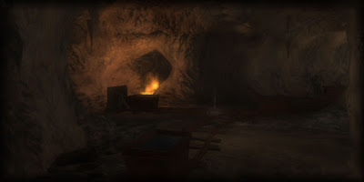
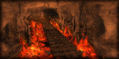
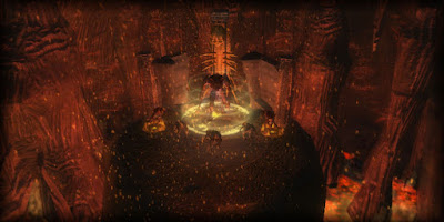
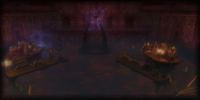
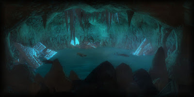
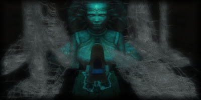
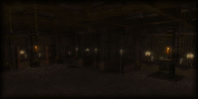
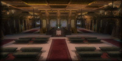
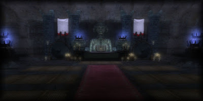
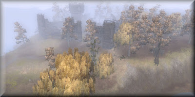
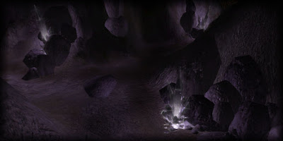
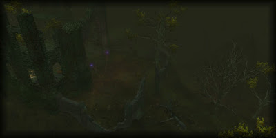
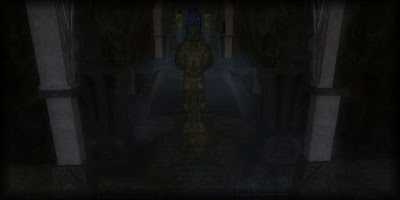
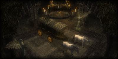
SO let me know if you have any thoughts about how you like your loadscreens to look
Saturday, January 09, 2010
Rock and Gnoll


