Couple more shots trying ideas out - but I could easily get caught fiddling with this forever without making any real progress. I've made the logo slightly transparent, and tried a frame and title. Kamal's been helping out toy with hiding the logo in the image too. So I guess I'm now left to decide on the presence/absence of the frame, logo, and text.... and after all of this, I think I'm prefering the simplicity of the shots in the previous post, but with the new faded logo)... as ever, comments/thoughts welcome
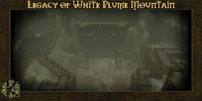
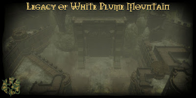
(FYI the font is that used in the 3rd ed Forgotten Realms logo)
Right, this weekend I stop messing about in photoshop and focus on the content!



5 comments:
My previews I sent you used the old DnD original edition fonts. But this font is better. Personally I prefer the borderless version.
Both are OK. I like the border with the text and would probably prefer the "borderless" without the text.
Lance.
Ya stop piddling with the loadscreens and get to work!
No but really if there is a way to put the logo into the background thats cool.
I will have to do the loadscreens all the end. If I ever do another mod I will do it area by area, full polished and complete before going on. That way you can end it at any time. So doing the load screens now is thumbs up if you ask me.
Playing with all the goodies ourside the game, as loadscreens, load hints and intro movies can eat lots of hours. I think you should go with the one with the wooden border. It looks professional enough. Now get back to finish the module!!! I've played through Trinity three times and is done with Misery Stone and get very grumpy when I'm out of high quality modules to play. :)
If you want a helping hand you know where to find it.
I vote for the border. That font is really cool too.
Post a Comment