Having played with borders and not found one exactly right, I've come up with the following as a sample - using FilterForge's 'Film effect' (at minimally intrusive seting as I didn;t want it too stylised) and I've added the symbol of Keraptis - the arch 'villain' from the White Plume Mountain modules. There's a sample below. The scheme seems to work well, especially given a lot of the interior loadscreens are quite dark, and it's not too intrusive.
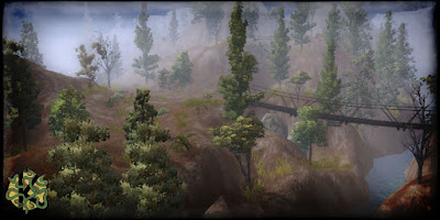
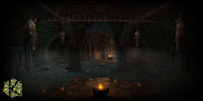
I feel I should also throw in the disclaimer, that there's several prefabs in use, albeit most modified to vary degrees - so I haven't suddenly become some mad area-baking fool...!



5 comments:
I think they look really good, nice work!
One thing, is it possible to "fade" the symbol a little bit? It stands out a bit as it is now I think. I'm not familiar with visual design so I don't know how you do it.
Really looking forward to this mod.
Yes. They work well.
Thanks for the reassurance you are not creating areas faster than I can breathe. ;)
Lance.
Great job Wyrin - these will work great "in game". Re the prefabs - I have gone the same route to some extent - lets me use my scant toolset time on all the other details - and there are some great prefabs out there!
Looking good. Though I'm with SW for stonewashing the logo to blend it further with the backdrop.
You got some good looking screenies there! This mod looks as promising as I thought it would be.
Post a Comment